Lightbox
Full-screen image viewer on the overlay stack: open from a thumbnail, step through a gallery by arrow, key or swipe, zoom up to 4x with pinch, wheel or double-click, and dismiss with Escape, a backdrop click or a swipe down.
<arc-lightbox>Overview
Lightbox shows a gallery of images at full screen, above the page behind a blurred backdrop. It shares the overlay infrastructure with Dialog and Sheet: focus is trapped while open, page scroll is locked, Escape and a backdrop click dismiss, and focus returns to the trigger on close. Open it from a thumbnail with show(index), or set open and index directly.
There are two ways to give it pictures. Set the images property to an array of src strings or { src, alt, caption, srcset, sizes, width, height } objects; the forms mix freely. Or set gallery to a selector for links already on the page, such as gallery="#photos a". Each matched <a href> becomes an entry, with alt text from the image inside it and a caption from data-caption. A click on one opens the viewer on that picture. The links are read at click time, so ones added later are included, and without JavaScript they still open the full-size image.
Navigation wraps at both ends: the arrow buttons, the arrow keys, Home and End, or a sideways swipe on touch. Each step fires arc-change with the new index, and the images either side of the current one are fetched ahead so a step shows at once. A slow image gets a quiet spinner after 150ms; one that fails shows a short message and its alt text instead of a broken picture.
Zoom runs from 1x to 4x. Pinch or Ctrl + wheel zooms toward the fingers or the pointer, a double-click or double-tap zooms to 2x at that spot, and +, - and 0 step and reset it. While zoomed, dragging and the arrow keys pan, and the image's edges never come inside the frame. Navigating or closing resets the zoom.
Opened from a thumbnail, the picture grows out of it, and on close it shrinks back into the thumbnail of whichever image is showing. Each step slides the picture a short way in the direction of travel. Under reduced motion both become a plain fade. A gallery link is its own origin; for the images property, the element clicked or focused when show() ran is the origin for the image it opened on, and an entry's origin (an element or a selector) names one for any image.
Add thumbnails for a filmstrip under the picture. It stays faint until you point at it or tab into it, marks the current image with a short glowing bar, and jumps on click. An entry's thumb gives it a small source; otherwise the strip uses src, loaded lazily.
The top bar and the arrows fade after a few seconds without movement, and come back on any pointer movement, key press or tap. They stay while a keyboard user has focus in them. The actions slot adds your own buttons to the bar, for download or share.
next(), prev() and close() drive the viewer from outside, with the same events as the built-in controls. arc-close is cancelable on every path, including a swipe down and a programmatic close(), so a veto always holds.
Guidelines
When to use
- Use Lightbox for photo galleries, screenshots, and any image worth inspecting at full size
- Prefer `gallery` when the thumbnails are already links to the full images; it keeps working without JavaScript
- Open it from a visible thumbnail so the viewer starts on the image the user chose
- Provide `alt` text for every entry. It also labels the dialog and is read out on each step
- Add `thumbnails` for galleries longer than a handful of images, where the counter alone makes jumping around slow
- Pass `width` and `height` when you know them, so the frame holds its shape while the image loads
- Use `caption` for attribution or context that should travel with the image
- Listen for `arc-change` when something outside the viewer should track the current image
When not to use
- Do not use Lightbox for non-image content. Dialog is the general-purpose overlay
- Do not open it on page load; a full-screen takeover should be the user's choice
- Do not pass small thumbnails as the `src`. Supply full-resolution sources, or a `srcset` that includes them
- Do not put a second overlay on top of it; close one surface before opening another
Features
- Full-screen overlay with backdrop blur, sharing the focus-trap and scroll-lock infrastructure used by Dialog and Sheet
- Accepts plain `src` strings or `{ src, alt, caption, srcset, sizes, width, height }` objects in the same `images` array
- `gallery` builds the list from links already on the page and opens on click, with no script
- Arrow buttons, arrow keys, Home/End and sideways swipes, wrapping at both ends
- Zoom from 1x to 4x by pinch, Ctrl + wheel, double-click or double-tap, anchored where you point; pan by drag or arrow keys
- Swipe down to close on touch
- Neighbouring images preloaded; a delayed spinner for slow loads and an error state for failed ones
- Controls carry their own backing so they read over bright photos, and fade when idle
- `actions` slot for extra bar buttons such as download or share
- Grows out of the thumbnail it was opened from and shrinks back into it on close; steps slide in the direction of travel
- Optional `thumbnails` filmstrip with per-entry `thumb` sources, lazy-loaded
- Monospace `3 / 12` counter; screen readers hear "3 of 12" and the alt text
- `arc-close` is cancelable on every dismissal path; `arc-change` carries the new index on `detail.value`
- Focus is trapped while open and restored to the trigger element on close
Preview
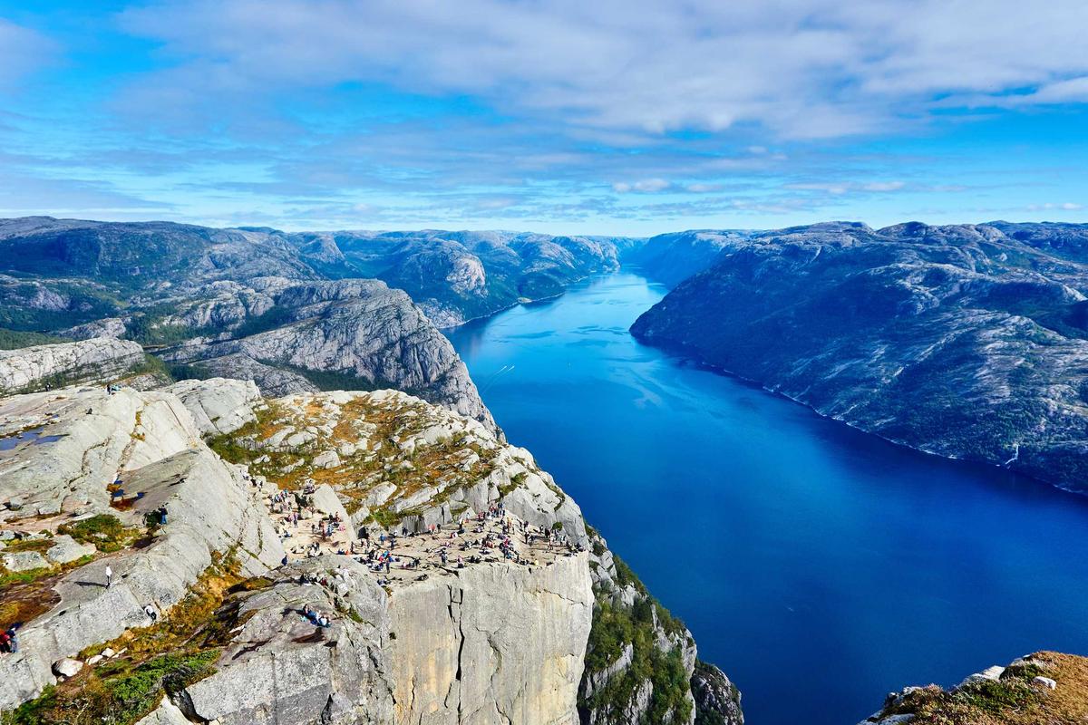
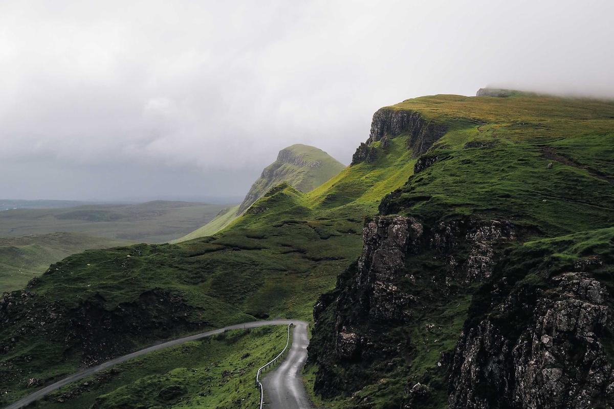
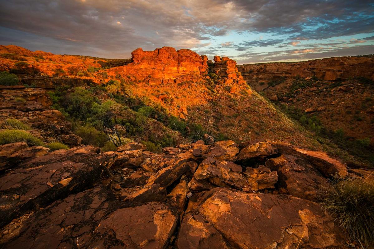
Usage
This component requires JavaScript. No pure HTML/CSS version is available. Use the Web Component directly or a framework wrapper.
<div id="photos">
  <a href="/photos/valley.jpg" data-caption="A river valley in evening light">
    <img src="/photos/valley-thumb.jpg" alt="River valley" />
  </a>
  <a href="/photos/slope.jpg">
    <img src="/photos/slope-thumb.jpg" alt="Mountain slope" />
  </a>
</div>

<arc-lightbox gallery="#photos a" thumbnails>
  <arc-icon-button slot="actions" name="download-simple" label="Download" variant="ghost"></arc-icon-button>
</arc-lightbox><img id="thumb" src="/photos/valley-thumb.jpg" alt="River valley" />
<arc-lightbox id="viewer"></arc-lightbox>
<script>
const viewer = document.querySelector('#viewer');
viewer.thumbnails = true;
viewer.images = [
{
src: '/photos/valley.jpg',
thumb: '/photos/valley-thumb.jpg',
alt: 'River valley',
caption: 'A river valley in evening light',
origin: '#thumb',
},
{ src: '/photos/slope.jpg', alt: 'Mountain slope' },
'/photos/canyon.jpg',
];
document.querySelector('#thumb').addEventListener('click', () => viewer.show(0));
</script>import { Lightbox } from '@arclux/arc-ui-react';
import { useState } from 'react';
const images = [
{ src: '/photos/valley.jpg', alt: 'River valley', caption: 'A river valley in evening light' },
{ src: '/photos/slope.jpg', alt: 'Mountain slope' },
'/photos/canyon.jpg',
];
function Gallery() {
const [open, setOpen] = useState(false);
return (
<>
<img src="/photos/valley-thumb.jpg" alt="River valley" onClick={() => setOpen(true)} />
<Lightbox images={images} open={open} onArcClose={() => setOpen(false)} />
</>
);
}<script setup>
import { ref } from 'vue';
import { Lightbox } from '@arclux/arc-ui-vue';
const open = ref(false);
const images = [
{ src: '/photos/valley.jpg', alt: 'River valley', caption: 'A river valley in evening light' },
{ src: '/photos/slope.jpg', alt: 'Mountain slope' },
'/photos/canyon.jpg',
];
</script>
<template>
<img src="/photos/valley-thumb.jpg" alt="River valley" @click="open = true" />
<Lightbox :images="images" :open="open" @arc-close="open = false" />
</template><script>
import { Lightbox } from '@arclux/arc-ui-svelte';
let open = $state(false);
const images = [
{ src: '/photos/valley.jpg', alt: 'River valley', caption: 'A river valley in evening light' },
{ src: '/photos/slope.jpg', alt: 'Mountain slope' },
'/photos/canyon.jpg',
];
</script>
<img src="/photos/valley-thumb.jpg" alt="River valley" onclick={() => open = true} />
<Lightbox {images} {open} on:arc-close={() => open = false} />import { Component } from '@angular/core';
import { Lightbox } from '@arclux/arc-ui-angular';
@Component({
imports: [Lightbox],
template: `
<img src="/photos/valley-thumb.jpg" alt="River valley" (click)="open = true" />
<arc-lightbox [images]="images" [open]="open" (arcClose)="open = false"></arc-lightbox>
`,
})
export class GalleryComponent {
open = false;
images = [
{ src: '/photos/valley.jpg', alt: 'River valley', caption: 'A river valley in evening light' },
{ src: '/photos/slope.jpg', alt: 'Mountain slope' },
'/photos/canyon.jpg',
];
}import { createSignal } from 'solid-js';
import { Lightbox } from '@arclux/arc-ui-solid';
const images = [
{ src: '/photos/valley.jpg', alt: 'River valley', caption: 'A river valley in evening light' },
{ src: '/photos/slope.jpg', alt: 'Mountain slope' },
'/photos/canyon.jpg',
];
function Gallery() {
const [open, setOpen] = createSignal(false);
return (
<>
<img src="/photos/valley-thumb.jpg" alt="River valley" onClick={() => setOpen(true)} />
<Lightbox images={images} open={open()} onArcClose={() => setOpen(false)} />
</>
);
}import { useState } from 'preact/hooks';
import { Lightbox } from '@arclux/arc-ui-preact';
const images = [
{ src: '/photos/valley.jpg', alt: 'River valley', caption: 'A river valley in evening light' },
{ src: '/photos/slope.jpg', alt: 'Mountain slope' },
'/photos/canyon.jpg',
];
function Gallery() {
const [open, setOpen] = useState(false);
return (
<>
<img src="/photos/valley-thumb.jpg" alt="River valley" onClick={() => setOpen(true)} />
<Lightbox images={images} open={open} onArcClose={() => setOpen(false)} />
</>
);
}API
gallerystringnull- CSS selector for links on the page to build the gallery from, such as
#photos a. Each match becomes an entry:hrefis the image, the inner<img>'saltis the alt text, anddata-caption(or the image'stitle) is the caption. A click on a match opens the viewer on it. Resolved against the lightbox's own document or shadow root, so links added later are included. Ignored whileimageshas entries. thumbnailsbooleanfalse- Shows a filmstrip of small thumbnails under the image. Each is a button that jumps to its image; the strip stays faint until pointed at or focused, and fades with the other controls when idle.
imagesArray[]- The gallery to display. Each entry is either a
srcstring or an object of shape{ src, alt, caption, srcset, sizes, width, height, thumb, origin }; everything butsrcis optional.widthandheightreserve the image's shape while it loads.thumbis a small source for the filmstrip (it falls back tosrc).originis the element the picture grows out of on open and back into on close, as an element or a selector; without it the viewer uses the element that was clicked or focused whenshow()ran, for the image it opened on. Set as a property, or as a JSON attribute for a gallery that is static. indexnumber0- Index of the image currently displayed. Navigation wraps at both ends, so setting it out of range shows the nearest valid image.
openbooleanfalse- Controls the visible state of the viewer. Set to
trueto open at the currentindexand activate the focus trap; set tofalseto close and restore focus to the previously-focused element.
Methods
show(index?)index?: number- Open the viewer, optionally jumping to a specific image first.
close()- Closes the viewer through the cancelable arc-close contract.
next()- Advances to the next image, wrapping past the end.
prev()- Steps to the previous image, wrapping past the start.
Events
arc-changedetail:{value: number, index: number}- Fired when the displayed image changes.
detail.valueis the new index. arc-close- Fired when the lightbox closes. Cancelable: call
preventDefault()to veto the close. arc-open- Fired when the lightbox opens
See Also
- CarouselA scrollable slide container with navigation arrows, dot indicators, auto-play, looping, and keyboard controls.
- ImageEnhanced image component with shimmer loading skeleton, smooth fade-in transition, error fallback, and aspect ratio presets.
- DialogGeneral-purpose focus-trapping overlay on the platform <dialog>, with backdrop blur, a slide-up entrance, and Escape-to-dismiss. For forms, settings, and content that needs full user attention.