Image Compare
Before/after comparison with two layered images and a draggable divider revealing one over the other.
<arc-image-compare>Overview
Image Compare layers two images and reveals the before slot over the after slot up to a draggable divider. The reveal is a pure CSS clip driven by the position property (0–100, defaulting to a centered 50), so the component server-renders at its initial position and never measures the images on load. Both slots accept a plain <img> or an arc-image; the two should share an aspect ratio, since the top layer is cropped to cover the frame.
The divider carries a circular grab handle that is also the keyboard control: a focusable role="slider" that moves by 1 with the arrow keys, by 10 with Shift held, and jumps to either extreme with Home and End. Dragging emits arc-input continuously and arc-change once on release, so live readouts and expensive persistence can subscribe separately.
orientation is named for the axis the divider moves along: horizontal (the default) slides a vertical divider line left and right, while vertical slides a horizontal line up and down. The horizontal axis is logical. Position 0 is the inline-start edge, so the whole control mirrors in right-to-left documents along with the reading order. Optional before-label and after-label props float muted caption chips over the corners of each region.
Guidelines
When to use
- Slot two images of the same subject and aspect ratio. The point is the difference between them
- Set `before-label` and `after-label` when the direction of the edit is not obvious from the images alone
- Give the handle a descriptive `label` so screen reader users know what the slider compares
- Use `arc-input` for cheap live readouts and `arc-change` for anything expensive or persisted
When not to use
- Do not use it as a gallery for unrelated images. That is a job for arc-carousel
- Do not compare text or code revisions with it. A rendered diff communicates changes precisely; sliding pixels does not
- Do not slot images with different aspect ratios. The top layer is cropped to cover and the comparison stops being honest
- Do not preset `position` near 0 or 100. A nearly hidden layer defeats the invitation to drag
Features
- Two named slots, `before` and `after`, that accept `<img>` or `arc-image`
- CSS clip-path reveal driven by `position` (0–100), so it server-renders at the initial split
- Pointer dragging anywhere on the frame, with `arc-input` while moving and `arc-change` on release
- Focusable divider handle with `role="slider"`: arrows step by 1, Shift+arrows by 10, Home/End to the extremes
- Orientation named for the motion axis: `horizontal` (default) or `vertical`
- Optional floating caption chips via `before-label` and `after-label`
- Logical horizontal axis. The control mirrors automatically in RTL documents
- Exposed CSS parts: container, before, after, divider, handle, label-before, label-after
Preview
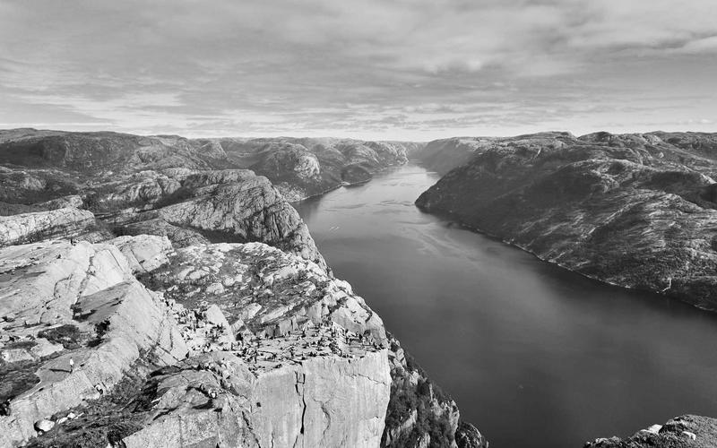
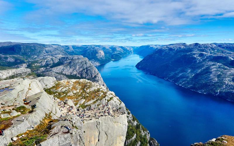
Usage
Image Compare is in the marketing domain group, so it is absent from the default @arclux/arc-ui barrel. Import it from@arclux/arc-ui/marketing, or from its own subpath@arclux/arc-ui/image-compare. Everything else (the element, the CSS, the framework wrappers, the support it gets) is unchanged.
This component requires JavaScript. No pure HTML/CSS version is available. Use the Web Component directly or a framework wrapper.
<arc-image-compare
  label="Color grade comparison"
  before-label="Original"
  after-label="Graded"
  position="50"
>
  <img slot="before" src="/photos/valley-raw.jpg" alt="River valley, unedited" />
  <img slot="after" src="/photos/valley-graded.jpg" alt="River valley, color graded" />
</arc-image-compare>

<!-- Vertical divider motion -->
<arc-image-compare orientation="vertical" label="Sky replacement">
  <img slot="before" src="/photos/sky-raw.jpg" alt="Original sky" />
  <img slot="after" src="/photos/sky-replaced.jpg" alt="Replaced sky" />
</arc-image-compare>
import { ImageCompare } from '@arclux/arc-ui-react';
export default function Example() {
return (
<ImageCompare
label="Color grade comparison"
beforeLabel="Original"
afterLabel="Graded"
onArcChange={(e) => console.log('committed at', e.detail.value)}
>
<img slot="before" src="/photos/valley-raw.jpg" alt="River valley, unedited" />
<img slot="after" src="/photos/valley-graded.jpg" alt="River valley, color graded" />
</ImageCompare>
);
}<script setup>
import { ImageCompare } from '@arclux/arc-ui-vue';
</script>
<template>
<ImageCompare label="Color grade comparison" before-label="Original" after-label="Graded">
<img slot="before" src="/photos/valley-raw.jpg" alt="River valley, unedited" />
<img slot="after" src="/photos/valley-graded.jpg" alt="River valley, color graded" />
</ImageCompare>
</template><script>
import { ImageCompare } from '@arclux/arc-ui-svelte';
</script>
<ImageCompare label="Color grade comparison" before-label="Original" after-label="Graded">
<img slot="before" src="/photos/valley-raw.jpg" alt="River valley, unedited" />
<img slot="after" src="/photos/valley-graded.jpg" alt="River valley, color graded" />
</ImageCompare>import { Component } from '@angular/core';
import { ImageCompare } from '@arclux/arc-ui-angular';
@Component({
imports: [ImageCompare],
template: `
<arc-image-compare label="Color grade comparison" before-label="Original" after-label="Graded">
<img slot="before" src="/photos/valley-raw.jpg" alt="River valley, unedited" />
<img slot="after" src="/photos/valley-graded.jpg" alt="River valley, color graded" />
</arc-image-compare>
`,
})
export class ComparisonComponent {}import { ImageCompare } from '@arclux/arc-ui-solid';
export default function Example() {
return (
<ImageCompare label="Color grade comparison" beforeLabel="Original" afterLabel="Graded">
<img slot="before" src="/photos/valley-raw.jpg" alt="River valley, unedited" />
<img slot="after" src="/photos/valley-graded.jpg" alt="River valley, color graded" />
</ImageCompare>
);
}import { ImageCompare } from '@arclux/arc-ui-preact';
export default function Example() {
return (
<ImageCompare label="Color grade comparison" beforeLabel="Original" afterLabel="Graded">
<img slot="before" src="/photos/valley-raw.jpg" alt="River valley, unedited" />
<img slot="after" src="/photos/valley-graded.jpg" alt="River valley, color graded" />
</ImageCompare>
);
}API
before-labelstring''- Optional caption for the before layer, rendered as a floating chip in the start corner.
after-labelstring''- Optional caption for the after layer, rendered as a floating chip in the end corner.
labelstring''- Accessible name for the divider handle, announced as the slider label.
positionnumber50- Divider position as a percentage, 0 to 100. 0 shows only the after layer, 100 only the before layer. Clamped, reflected, and updated as the user drags.
orientation'horizontal' | 'vertical''horizontal'- Axis the divider moves along.
horizontal(default) moves a vertical divider line left-right;verticalmoves a horizontal line up-down.
Events
arc-inputdetail:{ value: number }- Fired continuously while dragging (every pointer move) and on each keyboard nudge.
valueis the position, 0-100. Use for live readouts. arc-changedetail:{ value: number }- Fired once when the position commits: on pointer release, or with each keyboard nudge. Use for persisting the position.
See Also
- ImageEnhanced image component with shimmer loading skeleton, smooth fade-in transition, error fallback, and aspect ratio presets.
- CarouselA scrollable slide container with navigation arrows, dot indicators, auto-play, looping, and keyboard controls.
- Aspect RatioContainer that enforces a width-to-height ratio on its content, for images, videos, and embedded media.
- Image CropperCrop-before-upload control with a draggable, resizable crop rectangle, aspect-ratio locking, zoom, and canvas export at natural image resolution.